Wednesday, January 23, 2013
Pop Art Project
Reflection:
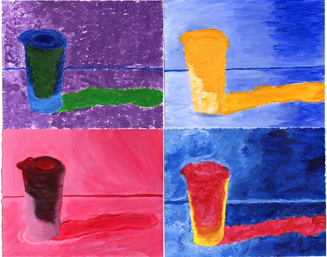
My first painting was the one in the lower left corner. The color scheme of this painting is monochromatic. Since it was my first one I hadn't realized that I could vary my brush strokes to create a liveliness for the painting. My second painting is the one in the upper right corner, which represents the complimentary color scheme. After finishing my first one, I realized that many of my peers were truly experimenting with different brush textures. I realized that during my first painting I had "over thought" about certain parts of my painting which ultimately restricted my creativeness for the first painting. For the second painting, I decided to try a slightly different attempt, I wanted to just simply get started and to have fun with experimenting different colors and brush textures. Along the way I would touch up certain parts of the painting that I was unsatisfied with but overall, I think that I was much happier with the creativeness in my second painting than my first painting. My third painting was the the one in the lower right corner, which represents the triadic color scheme. I realized that I often had difficulty with trying to mix the perfect color on my palette before applying it to my painting. I decided to fill my brush with both white and blue, for instance, to create a slightly different texture by allowing some white paint to be visible on my painting. Finally, my last painting was the one in the upper left corner, which represents the analogous color scheme. I chose to use green, blue, and purple as the three colors because I wanted to use purple since it was a color I hadn't used in my other paintings. During my group reflection, some of my peers had mentioned that they enjoyed the different textures of my painting. I also received some comments about my choice of allowing the white to show in certain parts of my painting.
When working with photography I was more concerned with adjusting the lighting so that I would get a scale of both light and dark. When I took a picture of my object, I was completely focused on trying to get the "perfect shadow" of my object. I hadn't paid attention to the unique darker part of the mug. When painting, I was focused on how my colors would be able to blend nicely together. I was also more focused on which parts of the photo required a darker shade of the color. Or when I was working on the triadic and analogous color schemes, I wanted to ensure that I picked a darker color for the dark part of photo. I think that I felt the most comfortable with the photography part of this project because I didn't feel as if I needed more planning before each composition. Whereas, during the painting part of this project, I realized that I often over thought about each step of my painting, instead of just creatively continuing with the painting. Overall, I have truly learned a lot about the different color schemes, as a matter of fact, I had even mentioned a complimentary color scheme during my French class when we were discussing the artistic choices of an advertisement!
Subscribe to:
Post Comments (Atom)

No comments:
Post a Comment