Friday, May 31, 2013

Final Survey Reflection


Which project do you consider your most successful? How did you develop your craft with this assignment? What tools, methods and materials were essential to your success with this project? What ideas, feelings or meanings did you want your piece to express? How did you go about expressing it? 
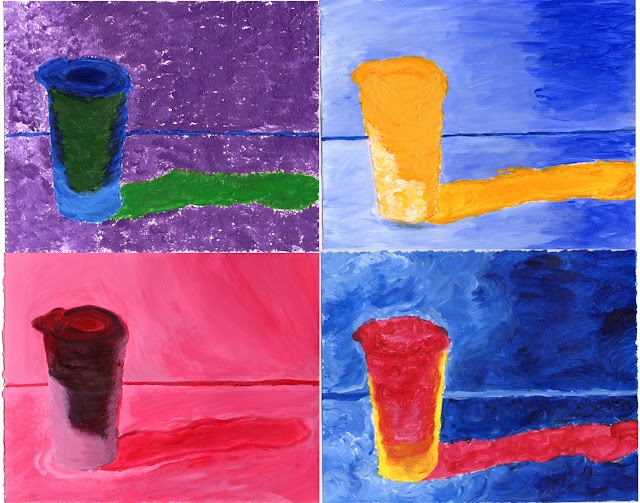


I would consider either my pop art or my recent form sculpture was the most successful. For the pop art, I felt that I was able to experiment with the colors more successfully. Also, during the pop art project, I felt that I had a lot more time to consider the colors and brush strokes of each painting. I also found it helpful that we had access to pictures of our object which clearly demonstrated the light scale which was helpful for me as I was painting because I could decide where to place the lighter and darker shades of paint. I think that it was also helpful that we had spent a lot of time and different steps about learning colors and different related concepts. For the pop art project, I had wanted to successfully convey the different color schemes such as complementary or triadic color schemes. I expressed it by carefully testing the different shades of each color before starting my final painting. I also thought that my most recent plaster sculpture was also successful. I was able to slightly alter my sculpture because I was given a block of plaster that was a lot shorter than I had expected.

Which project was the most challenging? Look at your brainstorming for this project. How does the final work(s) resemble your preliminary sketches? What changed? Why did you make the changes that you did? What problems emerged in the creation of this project? How did you solve the problems? 

Texture Sculpture

I think that the texture sculpture on the wooden square was the most challenging for me. I did not know how to successfully piece several different textures on the wooden block. I think that I didn't have a very thorough brainstorm of my texture, which is why I had a difficult time piecing several textures together. I had changed several of the textures I used which I think had also changed my process when I had tried to piece everything together. 

Please discuss three new strengths you've discovered or deepened this year. One formal strength (your ability to work with things like composition, balance, rhythm et cetera), one technical or media-specific strength (working in a specific medium or honing a specific skill) and one conceptual strength (you idea development in the specific project). 

I think that a strength that I have definitely developed includes being able to "improvise" as I work on projects. Sometimes, my plan for my project does not ultimately end up being the same as I had expected and so I have learned how to accept these slight changes and incorporate it into my project. I think that a formal strength includes working with symmetry or even color scales. I would say that my technical/media-specific strength would be the pop art project. I was successfully able to use the different color schemes and experiment with my brush strokes. I would actually consider my conceptual strength to be being able to be more flexible with changes in my project that might have differed from my original plan. 

Form Sculpture Unit


Reflection:
Restate your intentions for this project--how did you combine abstracting the figure with an outside influence?  
My original intentions for this project was to create a figure that was in the motion of kicking with one leg. Actually, I think that the shape and size of my original plaster block had greatly influenced how I abstracted the figure. I had originally planned for a block of plaster that was taller so that I could make a human figure. However, the shorter height of the block  influenced my final plan of how I could abstract my figure. Instead of having my sculpture look like a literal person standing, I had made it seem like the man was lying down while still indicating there was a sense of motion in the legs of the person, which was my initial goal. My intentions changed when I was given a block of plaster that had a shorter height than I had planned for.

How did you push yourself to gain a better understanding of the physical properties of the plaster?  In what ways did you come to better control the various tools you employed?
I had originally planned to use a hammer and chisel to efficiently get rid of larger parts of the plaster, however, I realized, that since my block of plaster was actually a lot smaller than most of my classmate's I could actually simply use a chisel to carve the plaster. I originally did not use the chisel as efficiently. However, I learned that having the flat side of the chisel against the part of plaster I wanted to keep would actually help efficiently get rid of more parts of the plaster. 

What were some of the specific formal areas you focused on to realize your piece? how did you employ form, gesture, texture to reinforce your intentions?
The bottom of my plaster block actually had the outline of the side of the milk carton that it was previously in. I used that structure as the bottom of my sculpture so that it would be able to stay situated on the table. I had employed texture through the different ridges and uneven parts of my sculpture to indicate the different parts of the person's body.


Tuesday, April 30, 2013

Value Project - Final Blog Post


Final Blog Post:
It was harder for me to work with charcoal because I had tried to create a spectrum of grays. I was often more intrigued by my photographs. When I took digital photographs I was not as aware of the value, however, after reflecting on the quality of the value of my digital photographs, I was more successful in the spectrum of grays in my photographs from the dark room. After observing that I needed to experiment more with the value of my photographs I had also tried to push myself to be more creative of the different places that I could place my object in. I think that after reflecting on the first digital photographs, I had a better sense of what I needed to capture in my photographs to show value. I definitely tried to play more with the lighting when taking pictures for the dark room. For instance, in my first three digital photographs, my object was clearly noticeable in the picture, however, I decided to  take a slightly different approach because I wanted to be more innovative and be able to learn from my first photographs. In my next set of pictures I had tried to keep my object more hidden and even have certain natural trees or leaves covering most of the object so that it would show a bigger contrast in the value scale between a natural and artificial object.
During my first charcoal drawing, I found it difficult to highlight certain parts in the drawing with the eraser. I often started erasing but it would sometimes be a shade of gray that was lighter than what I wanted. It was definitely difficult for me to be able to control the gray scale during the first charcoal drawing. However, when I started working on the second charcoal drawing, I actually appreciated having a slightly different approach. I felt that I was able to control the value scale better during the second drawing. I also found it helpful that instead of applying charcoal to the whole drawing and then using an eraser to highlight the lighter parts, that sketching and then applying charcoal was easier for me. I realized that during the second drawing, I had tried to consider all of the places where my object was a lot darker in value and then a apply a heavy amount of charcoal. This process was unlike my first charcoal drawing because during that drawing, I had focused on simply trying to get the light value scale.
I think that both mediums allowed for "expression" but in slightly different ways. For instance, in the drawings, I was really able to hone in on observing the detailed difference in the value scale. However, in the photographs, I was able to be more innovative and adjust the lighting to have different effects on my pictures.


Friday, April 5, 2013

Value Interim Reflection - Drawing


I am trying to evoke the different shades of my object's lighting through value. There is both a slight bit of natural light as well as the light from the spot light that shines on the object. I am also trying to use different shades of grey to contrast the folds of the fabric as well as the different lighting of the object. By having certain dark parts in my drawing as well as lighter, fading shades of grey, I am trying to evoke a sense of dimensionality in my drawing. I think I have been really focusing on creating parts of my drawing with extremely dark shades, however, I think that I should focus on starting to create the "medium grey" shades in my drawing. If I were to offer advice to someone who was about to start the drawing for this project, I would definitely recommend experimenting with the style and organization of the fabric surrounding your object. I have certain folds and curves in the fabric that are very intriguing and I definitely enjoy trying to experiment and figure out the exact shade that would be necessary for the fabric. I would also recommend playing around with the natural lighting and the spotlight. I have an object with a reflective surface, so the lighting definitely makes my drawing a lot more interesting and fun to work with because it creates a challenge for me to be able to blend the different shades of grey together in order to create a spectrum of grey values.

Tuesday, March 26, 2013

Charcoal Value Drawing

I think that it was easier for me to draw the metal can than drawing the leaves of the plant. I think that sometimes the lighting had changed so it was difficult for me to draw the lighting on the leaves accurately. Also, the wrench was definitely the hardest part of the drawing because of the plant's angle. The wrench was placed between the stems of some of the leaves but I didn't have a side angle of the wrench so it was really difficult for me to represent it accurately. However, it was a lot easier for me to consider the lighting of the can because it was more direct and didn't vary as much as the plant. I enjoyed trying to draw the leaves of the plant because although the lighting was a lot more difficult to draw, it was enjoyable because there were varied parts of the leaf. I wish I could have emphasized more on the lighting of the leaves. Overall, I definitely think that this was a great experience because I was more concerned about the value of the whole drawing.

Friday, March 15, 2013

Still Life Value Digital Photographs


Reflection:

Which photograph is the most evocative? Define evocative. Refer directly to the formal elements of the image & the relationship between object and nature. 
Evocative is often defined as suggesting or invoking a certain emotion or even a memory as an image. In my opinion, the third photograph is the most evocative. In this image, there is a clear relationship between the object and nature. Nature is represented by the rough, rigid turns of an old tree bark, whereas, the complete object isn't shown, but there is a part of the object that is shown in the photograph. I think that the main relationship between the metal canister and nature in this photograph is the sense that the object is slightly hovering the natural bark, which also creates a darker value in the part of the bark below the object.

Which photograph allows for the full value scale?
The second photograph allows for the full value scale because there are a variety of grays and the lighter white is represented by the reflective surface of the canister. 

Given these images and insights, what exactly will you be looking to capture in your black & white images?
I think that I could have tried to find a photograph that had captured the value scale better. I think that after experimenting with the digital photography, I realized that on the day when there was sunlight, it made my photograph more intriguing because I would be able to play with using the sunlight to evoke a certain aspect of my object in nature. I am definitely planning on capturing a wide value scale through using sunlight more creatively.

Thursday, March 7, 2013

Texture Collage & Sculpture

Texture Collage 

Texture Sculpture


Reflection Questions:
I think that my collection of textures were definitely varied in my collage. However, I was unable to find enough different types of textures for my sculpture. I think that my collage was varied in textures because I had combined rubbings that were the artificial patterns of the picnic tables along with the natural elements of a tree bark and the moss growing on the side of a tree. In my collage, I had spent a lot of time on trying to successfully juxtapose the rigid and exact patterns with a more natural, flowing pattern of the tree bark. I had tried to cut out certain parts of the picnic table pattern to reveal different types of textures underneath this pattern. I then cut out two strips and connected it from the picnic table pattern slanted in the same direction as the tree bark, which I think has successfully created a movement from a systematic pattern to another specific direction of the tree bark. In the sculpture, I had wanted to replicate the sense of movement between a more natural-like material (the burlap) and the more artificial object (the fish net). I had played around with the burlap by trying to pull apart certain parts creating frays which were indicating a movement towards the fish net. I had folded together a certain part of the fish net and showed that it was progressing to being unfolded to also imply a sense of texture throughout the sculpture. I think that I definitely pushed myself to refine my work on my collage, however, now that I am looking back, I think that I could have reworked my sculpture to have a cleaner and organized finish. I definitely think that my sculpture and collage are closely intertwined. They both display a sense of texture and different, contrasting materials are connected by a sense of motion. Also, I had a collage that was more filled with different textures; whereas, my sculpture also contrasted my collage because there are less textures but different overlaps and juxtaposed in more different ways.